As we all experience somewhere in our lives, it can be very boring and stifling to just assign a task and wait for that job to be completed. For this reason it is necessary to make this a little more fun. This is where a very deep art, called “gamification” comes into play. You can find many online courses, books, articles etc. on the subject. Today, I will talk about how you can use this technique in your team or project work, how we transfer it to our daily work as Yesil Science and how we took the Sprint Plan table we shared with you before, not just a step forward, but two steps forward.
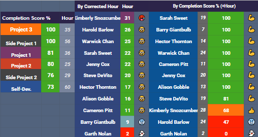
Since the first time we made the Sprint Plan chart, we’ve added a lot of gamification into it over time. One of them is the “Corrected Hour” section, which shows the total working hours of the people. Why “Corrected Hour”? Because we write in our sprint plan not only our work but also the courses we take to improve ourselves. Since these courses are individual, we made the scoring differently and added it as “Corrected Hour”. Here, we assign a color and emoji to people through 4 parameters. In this way, we can see the people who have taken a lot of workload or those who have a low workload compared to others, who barely have any tasks, that is, the “Ghosts” when they are invisible.
Emojis (workload) : 🥵→ Extra, 🤓→ Optimum, 🥶→ Few, 👻→ Ghost
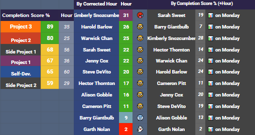
Another gamification is the “Completion Score” section, which shows how many percent of individuals complete their personal tasks at the end of the week. This place only uses business-related hours. Thanks to the formula we use here, this score is only visible on Monday (the day we completed the tasks of the previous week). Here, we made emoji assignments according to completion score over 4 parameters and color assignment over 3 parameters.
Emojis (% complete): 💪 → Great, 👍 → Good, 🥶 → Okay, 👻 → Bad
Finally, by processing all the parameters you see below with different coefficients (the importance of these coefficients was scored and averaged by the whole team), we get the total score (SCORE) of each person and create a leaderboard based on this score. The parameters we use in the calculation are:
- Corrected Hour: Remaining time after subtracting the hours spent for personal development from the total working hours to a certain rate
2. Product Hour: Time spent on the project
3. Self Development Hour: Time spent for personal development
4. Total Task: Total number of tasks taken
5. Hour / Task: Amount of time per task
6. Completion: Percentage of completing missions (closed until Monday)
7. Meetings Off (This week): Number of meetings not attended in the current week
8. Meetings Off: Number of meetings not attended by all weeks
9. Sprint Inputs Missing: The number of working hours it did not update during the Sprint
10. Sprint Inputs%: The ratio of working hours that it does not update during the Sprint to the working hours it should update
11. Task Report: Number of reports added at the end of the task
12. Task Report%: Percentage of reports added by total number of tasks
13. RS Presentation: Every Saturday, one or more people make a presentation to the team on a topic of their choice. Those who do get +1, those who do not when the week comes get -1 points. This works automatically in the system.
14. Team Harmony and Skills: Everyone in the team scores each other based on their communication and skills within a form. By passing this through a number of formulas, we reflect our score on the table. Thus, we integrate both subjects that normally remain very abstract into our calculation by concretizing them.
15. Daily Scrum%: The percentage of the report that is added on the days outside the meeting, explaining the daily work done.
16. Team Experience (Month): Time since the person joined the team (🦁> 👑> 👦> 👼)
So far, I have told you one step forward. Now it’s time to take this one step further 🙂 How?
All this data, colorful tables are nice, but it is tiring for people to enter and fill in excel constantly. We thought how we could do this data more neatly, without going through excel sheets. And we found the answer: A mobile app! But we have to do this quickly and we need to do it so that we can use the excel spreadsheets that we have already used, so how will this happen? GlideApps is helping us at this point. This site provides you the opportunity to set up a web application either by receiving data from google sheets (ie excel) or through the templates it hosts. It has a very easy interface but of course it doesn’t take all that short to set up everything without problems. At first, it will take a considerable time (of course not enough to launch a mobile application, it will not even pass by), but afterwards you will have great comfort. Let’s get to know Yesil Science Scrum App together.
SIGN-IN
First of all, we encounter a login page like every application. You can log in here either via your gmail, another email address, or just with a password that you set. You can choose one of these options when developing the application.
LEADERBOARD
The first screen after logging in is the “Leaderboard” screen. With the filtering in the upper right, you can sort the people as SCORE or the parameters used for the SCORE calculation, in an increasing or decreasing way. Clicking on a name opens a screen where you can see all the parameters of that person. You can also see that person’s photo, email address and phone number. At the end of the page comes the section we call “Daily Scrum”. This is the part where we add the work we do on days we don’t have meeting (Tuesday, Thursday and Friday for us).
ATTENDANCE
Next to the leaderboard section is the Attendance section. People use this place to indicate whether they attended the meeting, attended late, left early, or was on leave.
DAILY SCRUM
The Daily Scrum section right next to Attendance is used to see the Daily Scrums that I have mentioned, day by day.
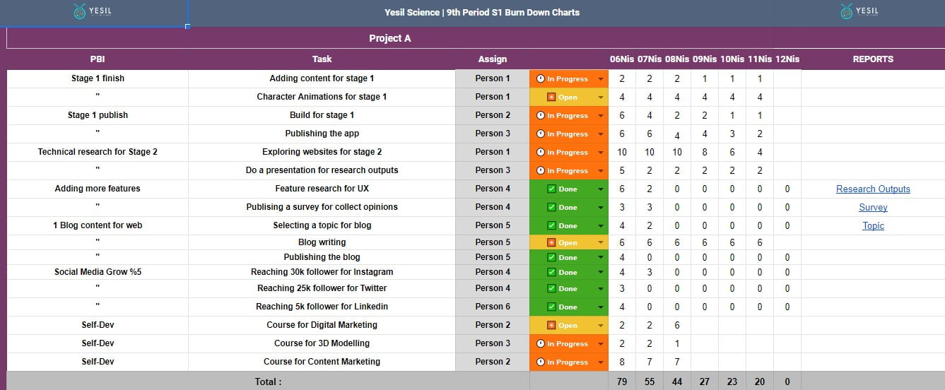
TASK
In this section, you can see the tasks given in the projects. You can see the tasks of the desired person only or more than one people by filtering from the top right. The sections on the page that opens when a task is clicked are;
- Status bar: Shows the status of the task; ✴ Open, 🕛 In Progress, ❌Incompleted, ✅ Done, 💤 Postponed
- PBI: the title to which the task will depend
- Task: The task to do
- Assign: The person who will perform the task
- Total Hour: The time set by the person for this task
- Missing input: If you forget to update that day, the system detects and notes this. This has a negative impact on the total score
- Report: If an end of task report has been added ✅, if not ⏳
- Daily Input: Where we enter the time we work daily. We write on Monday the start-up effort, how much time this task will take, then we move forward by subtracting the time we work every day. For example, if the initial effort is 8, if you worked 2 hours on Tuesday, you write 6 on Tuesday.
- Temporary Report: Document added temporarily
- Permanent Report: Final report added at the end of the task
NEW TASK
Here, we can add new tasks to the related project. We use the parts with 📚 emoji beside them to add ideas that are not urgent at the moment, which we call STORAGE. When you click one of them, you can fill the PBI, Task, Assign, initial effort and status sections from the page that opens.
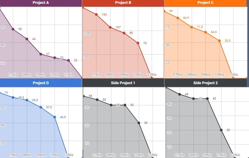
CHARTS
Finally, there is the “Charts” section. Here you can see graphically:
- The remaining business hours of the products day by day
- The completion scores of the products
- Hours per product
- Individual hours
- Individual completion scores
When you press the 3 lines on the top left, you will see a menu. The “Reports” section here is the section where the reports in the tasks are seen collectively. From the “Team Attendance” section, you can see who is attending to which meeting day by day. Finally, you can see the individual working hours and the corresponding emojis from the “Hours” section.
Here’s how our adventure, which started with a simple (!) Excel file, led us to make a great web-application (but maybe with some bias). Who knows how beautiful and compelling but satisfying places we will go from here.
I wish you to be the people who research, adapt and develop the technology you have discovered in this technology age; Stay with the technology, see you in my next post.

Furkan Kızılışık
CLINICAL TEAM
How Did We Work As A Team In The Corona Pandemic? - FluAI®
[…] we streamline the tasks of people within the team. Thanks to our gamified application that you can access from the link, we have also prevented the problem of falling out of the desire to do business due to the […]
Mobile Uygulama (App) Geliştirme Süreçleri Rehberi-2021 - Yesil Science
[…] Yesil Science olarak kullandığımız proje yönetim sistemi […]